Color maps, Isocontours and Height Fields
|
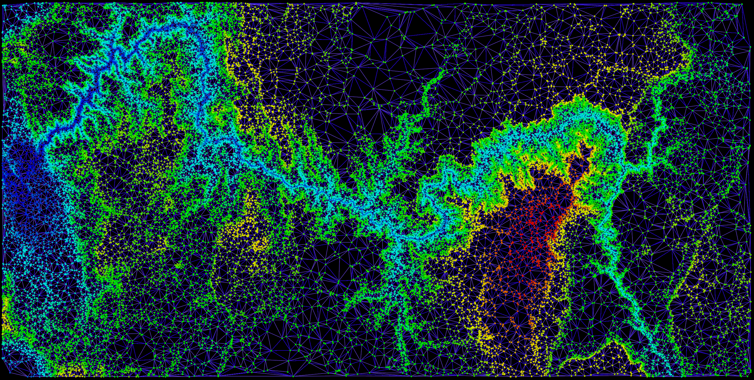
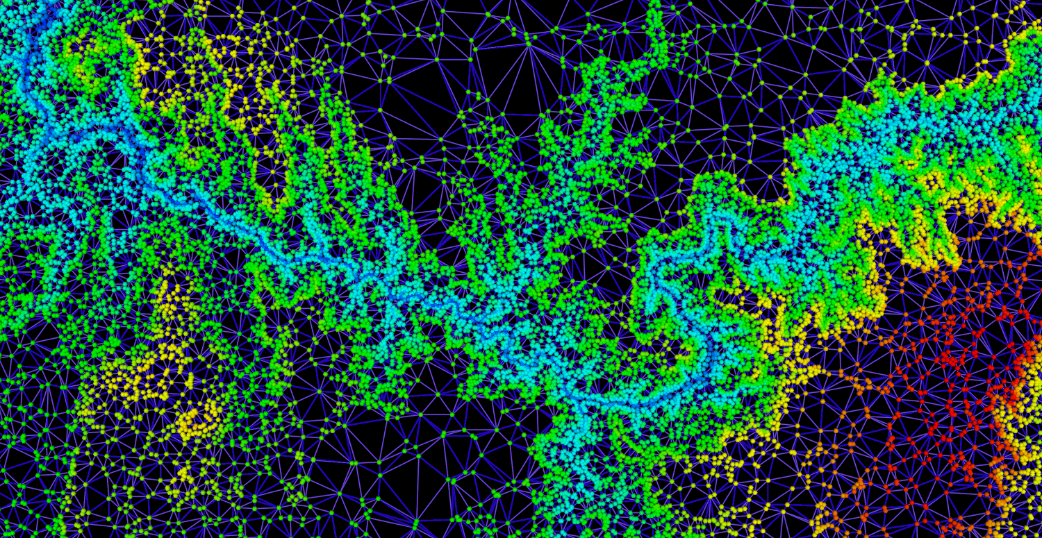
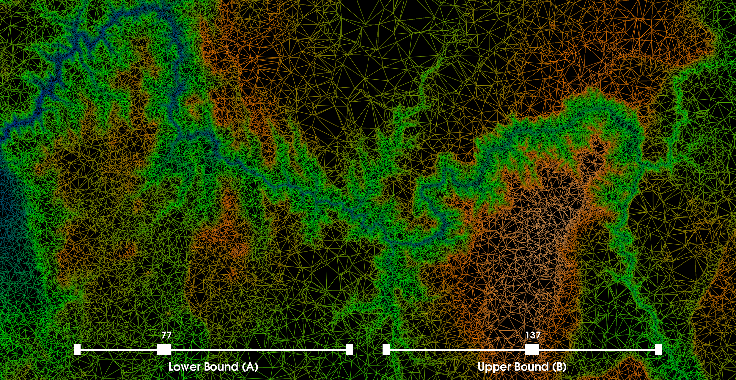
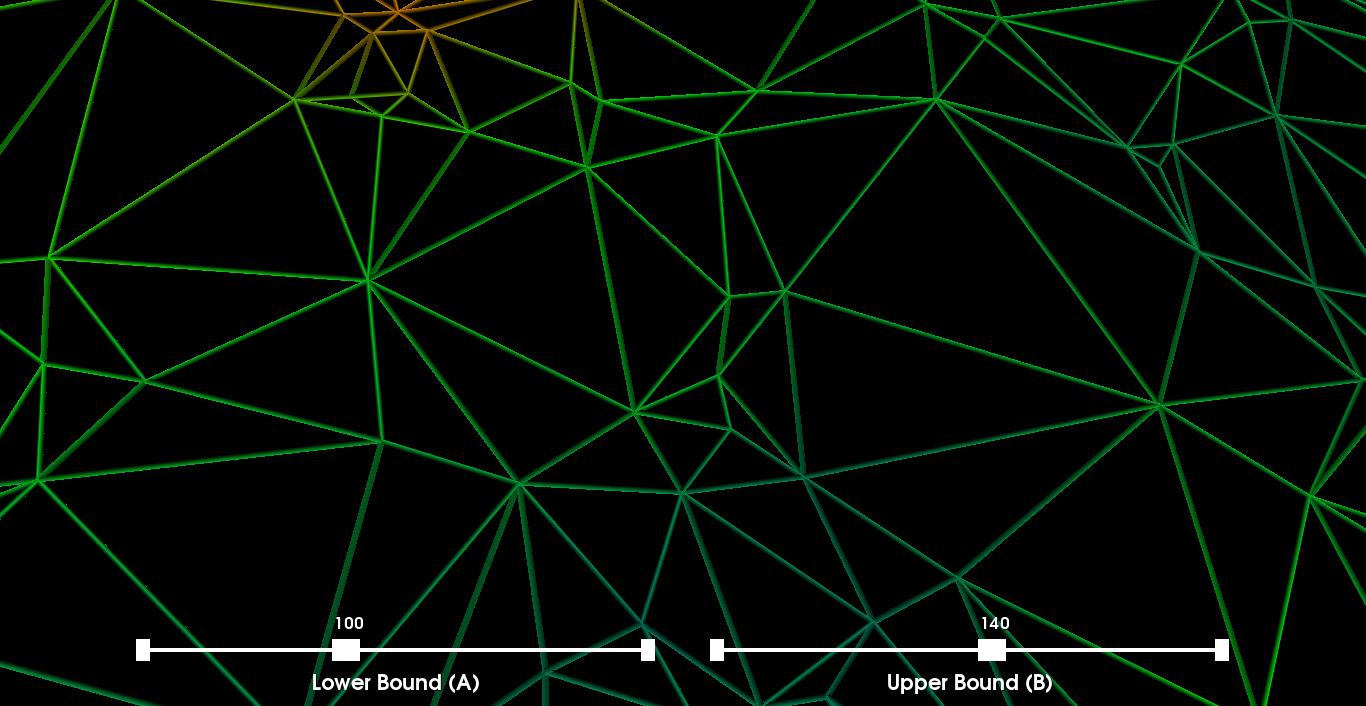
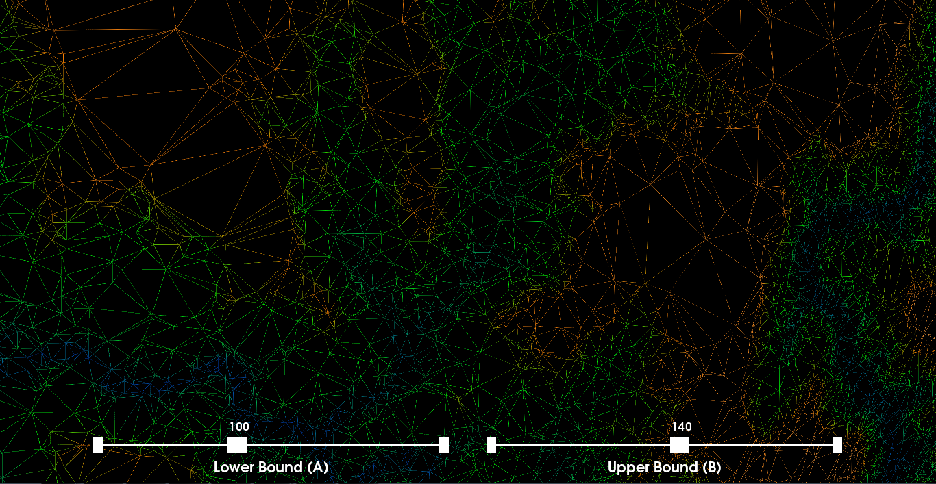
The dataset consists of 50,000 2D points generated from a picture depicting the grand canyon and each of the 50,000 points has a corresponding scalar value indicating the altitude. We visualize the data using 2D interpolation, color maps, isocontours and height fields. These aspects are discussed in more detail below. In each of the visualizations we set the camera to a default position, but we allow the user to interactively adjust the camera and move throughout the environment. We have also used non-traditional GUI Widgets that are also rendered. We have also provided the ability to take multiple screenshots by pressing the 'm' key. The resolution of the images is double the current size of the rendered window and are saved in the working directory. We set the tube and ball radius relatively large as the visualization looks better from a global perspective. If zooming for a very local view of the mesh, then perhaps a smaller value for the tube and sphere radius are warranted. Part 1: Scattered Data Interpolation via Delaunay TriangulationFirst, we must create a mesh from the 2D points. For this, we apply 2D Delaunay triangulation where the initial disconnected points are now associated with one another. In other words, we define a continuous representation of the discrete data using the surrounding points (i.e., piecewise interpolation with the 2D triangulation). The 2D Delaunay triangulation avoids skinny triangles which can significantly impact the performance of many visualization techniques. Further, we extract edges (i.e., an edge set) from the Delaunay triangulation and wrap tubes around each edge and similarily we visualize the initial 2D points as spheres. The tubes are assigned a uniform color. We also change a few shading properties for the tubes. The spheres are assigned a color corresponding to the altitutde of each point. To determine the color for each scalar value (i.e., altitude) associated with the points, we define a look-up table by setting an HSVA range and using a linear interpolation to generate the table. Discussion: In order to render the visualization in a timely manner, we reduced the number of polygons in the spheres by setting the discretization parameters to a low value. We also noticed that not all points were being triangulated and fixed this issue by setting the tolerance lower. The images on the right illustrate the mesh at different zooming/camera settings where the first image is zoomed out the furthest and the last image is a zoomed-in screenshot. |
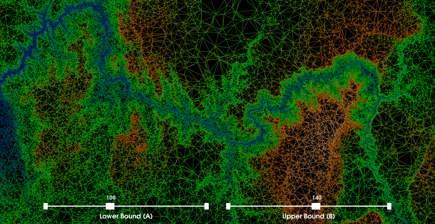
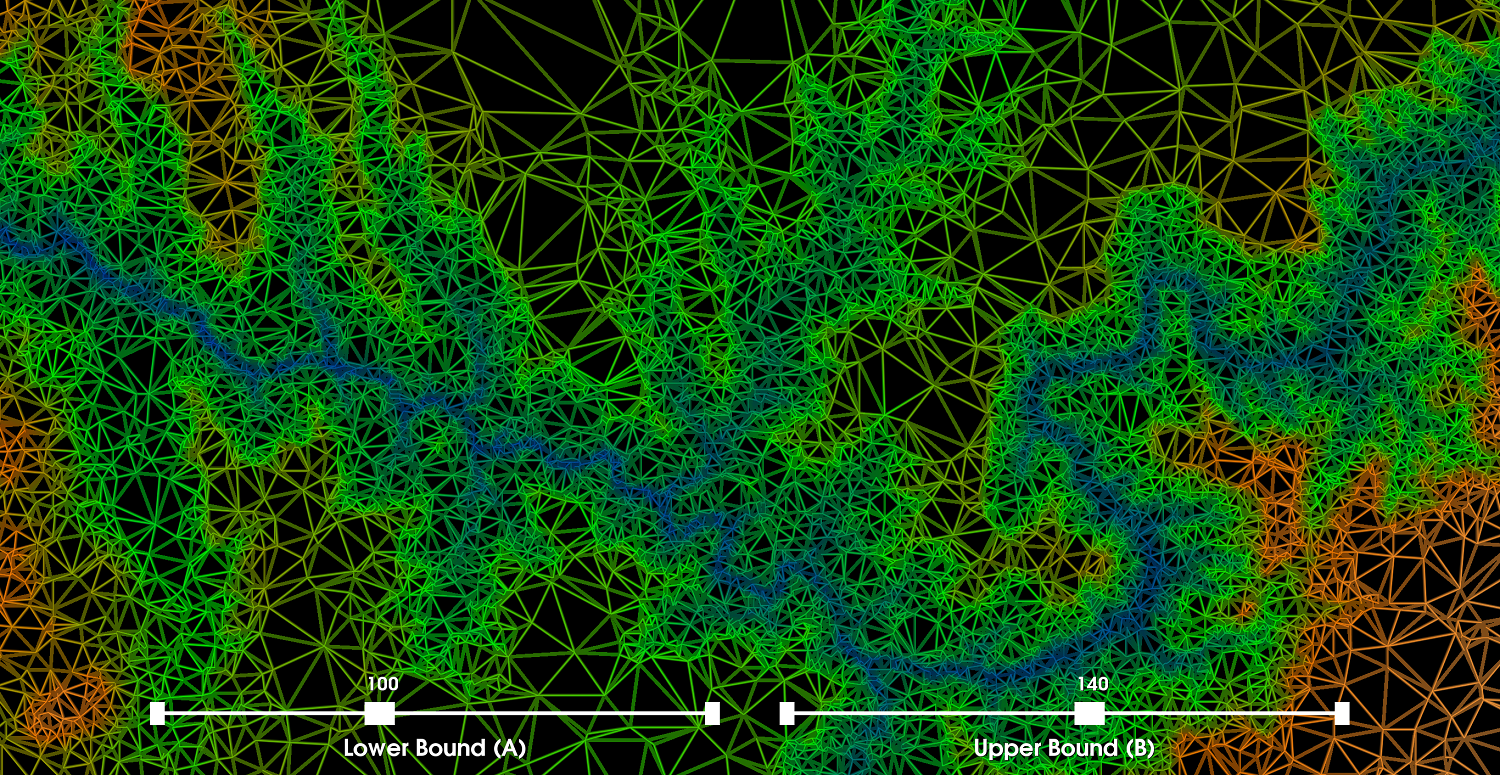
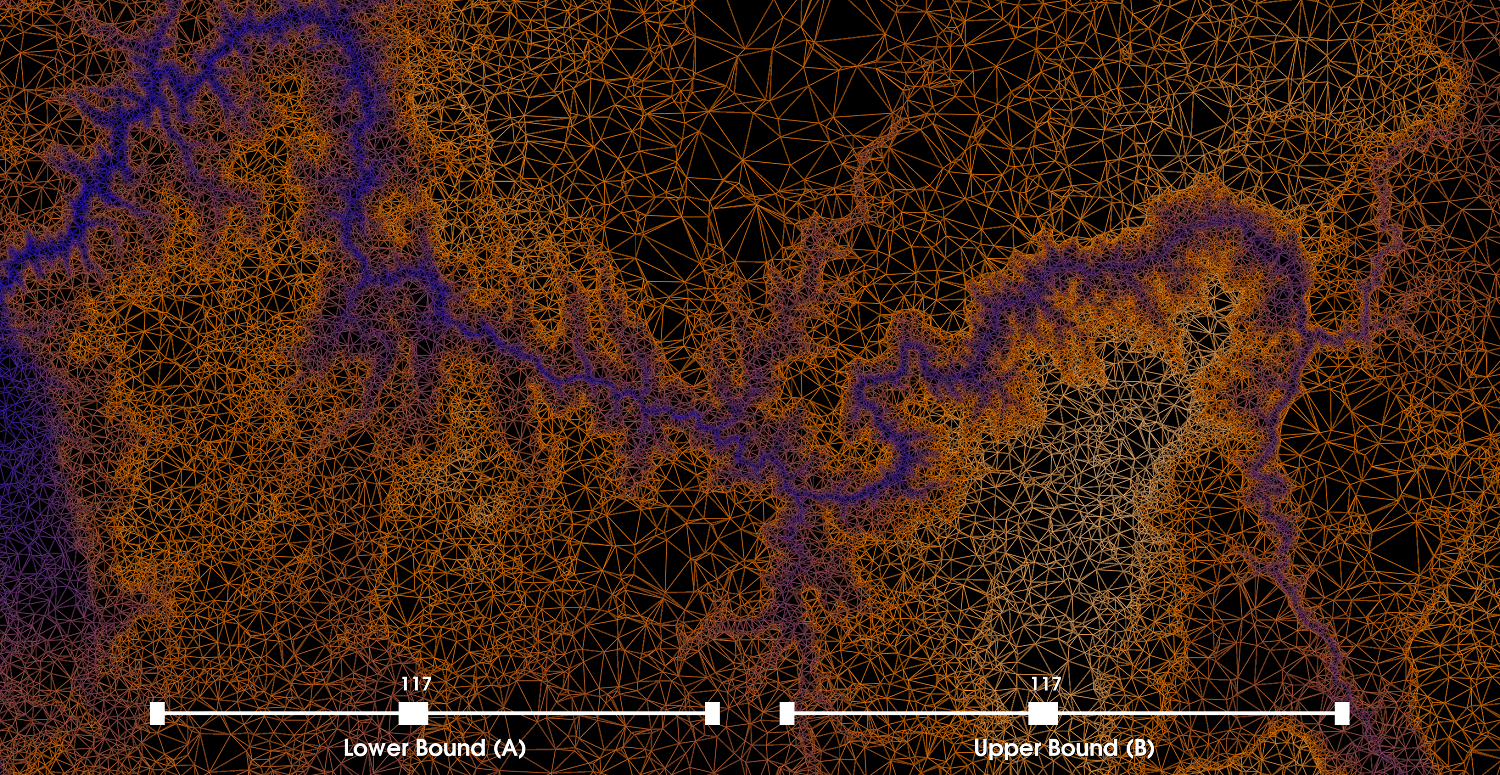
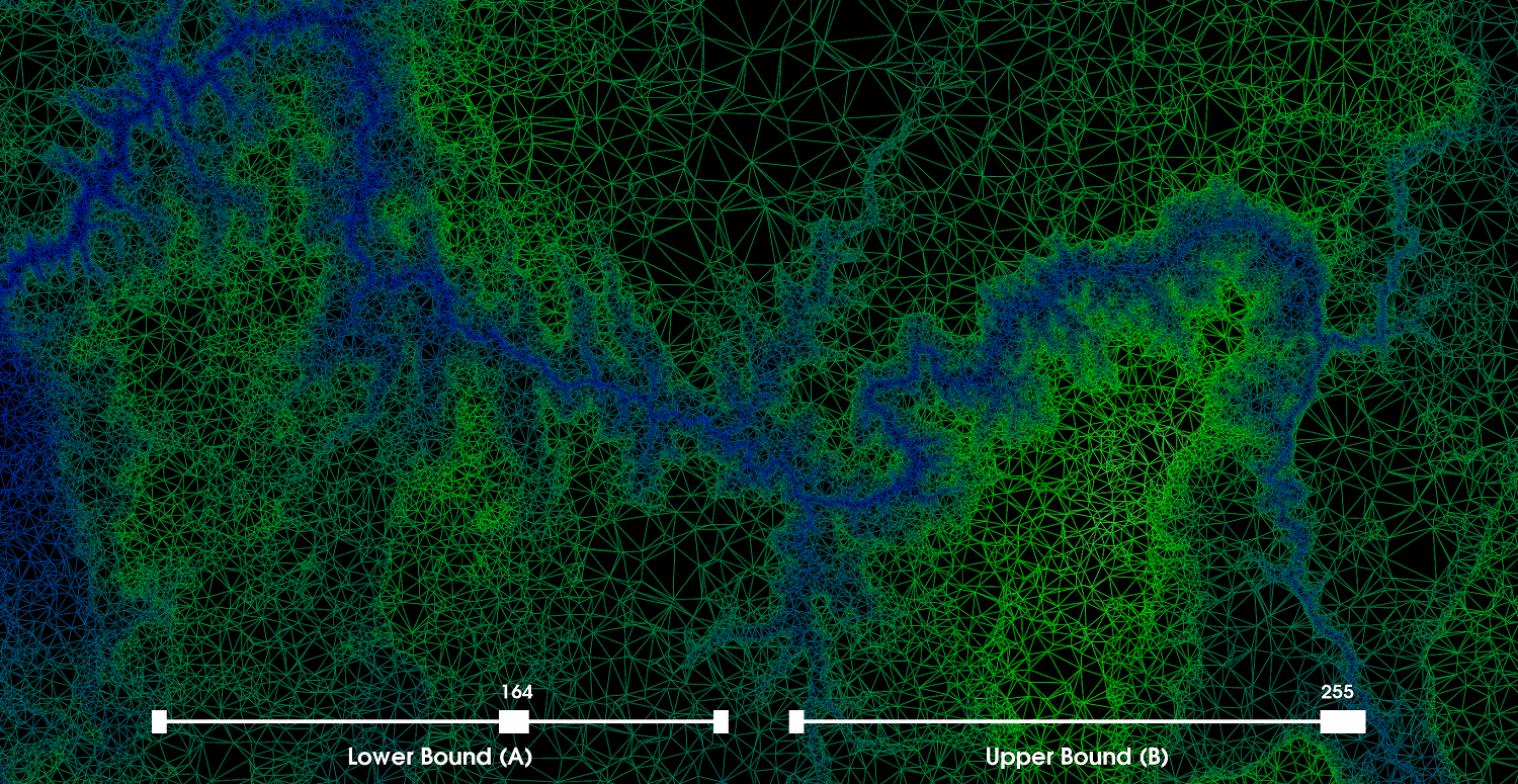
Part 2: Applying Color MapsIn this part, we apply a color map to visualize the 2D scalar field where the additional altitude scalar for each 2D point is used as a basis to map the colors in between two points in space by leveraging the previous 2D Delaunay triangulation. More precisely, we first define a color transfer function where blue corresponds to the altitude scalar of 0 and white corresponds to the altitude scalar of 255 (i.e., assuming the altitude scalars are between [0,255]). Further, we also define green and orange for arbitrary values in between [0,255] and provide the user with two sliders, one for green and orange. This allows the user to interactively change the color map by adjusting the sliders for green and orange. In particular, let the value A correspond to green and the value B correspond to orange, then the constraint 0<A<B<255 must hold. We then build a color look-up table using the defined color transfer function. The color look-up table consists of 256 colors each mapped to a particular scalar value between [0,255] where the color mapping depends on the users settings of A and B. Discussion: Both the color transfer function and the look-up table are dynamically built everytime the user adjusts a slider (i.e., using lazy-evaluation/pipelining). As previously, we wrap the edges in tubes where the colors for each edge is determined by adjusting the sliders as seen in the screenshots on the right. We also visualize the vertices as spheres using the same look-up table as the edges. The choice of a particular color map is somewhat subjective, but the selection can be guided by heuristics. For instance, the altitude range is [14,186] and if we further consider other statistical properties of the distribution of altitudes such as the mean altitude, we could intelligently choose the values of A and B such that we map more distinctive colors to the edges and vertices (i.e., we find an optimal balance between blue-green-orange-white where the distribution is split evenly between each color). One might also simply look at the visualization and determine a suitable color map for any arbitrary visualization. However, we believe the most optimal visualization with regards to the information a scientist could gain is achieved by finding the value of A and B such that the distribution is evenly split and the colors (shades of each) blue-green-orange-white are equally representative. Parameter Selection: For the values of A and B we selected 100 and 140, respectively. We used the method above as a heuristic to find the values that provide the most information. We also know that blue regions have the lowest altitude, while pure white regions are among the highest. More precisely, the relationship between color and height is: blue < green < orange < white. From our selected values, we can clearly distinguish regions of the highest and lowest altitudes and regions in between. Further, we see that as we move from left to right, the blue curve disappears gradually. The second screenshot illustrates a zoomed in view where the variance in color is seen more clearly. To make this visualization even more informative from a scientific perspective, we could have set the white color to be the max altitude and the blue color to be the min altitude and then the green and orange could be chosen using the heuristic above based on range and mean. |
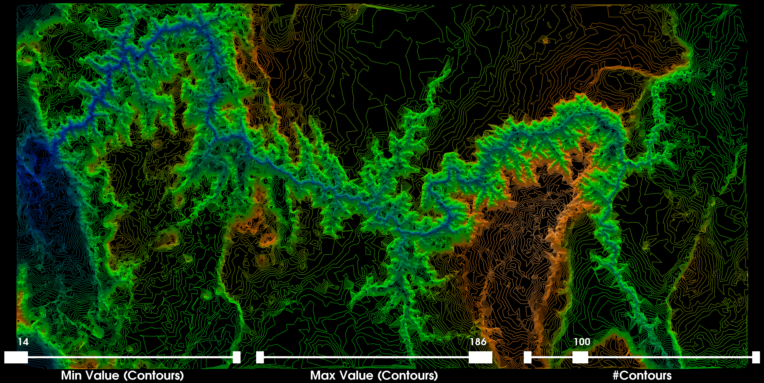
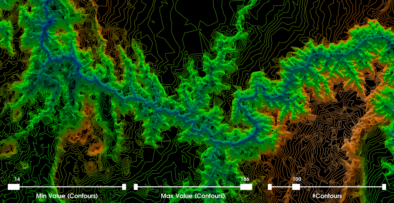
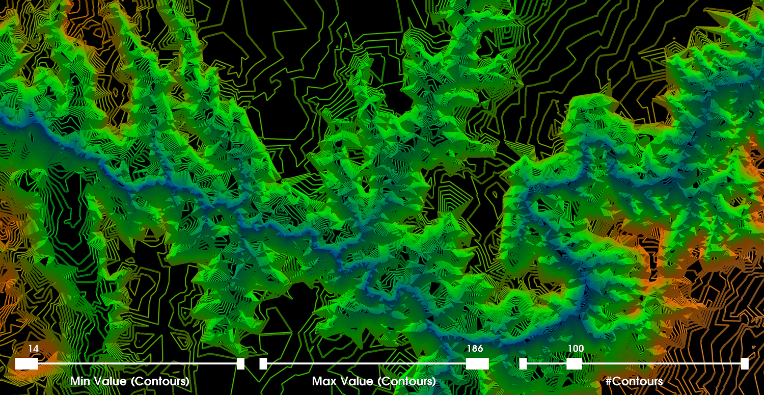
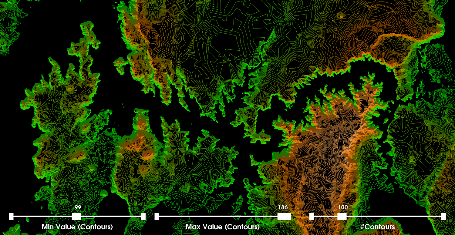
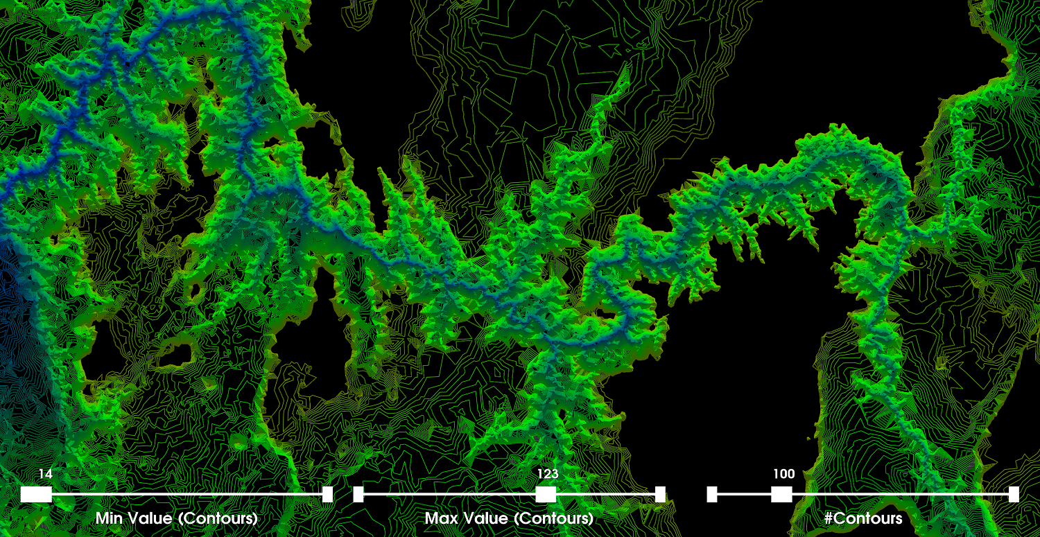
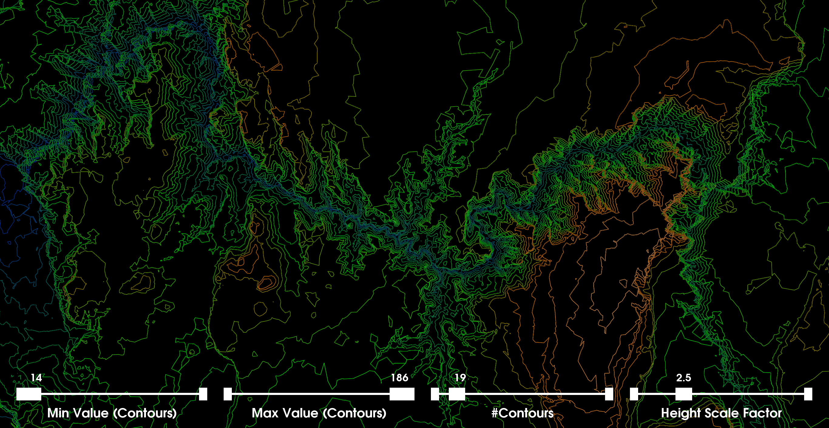
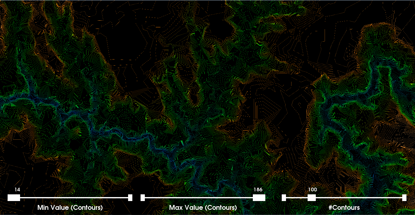
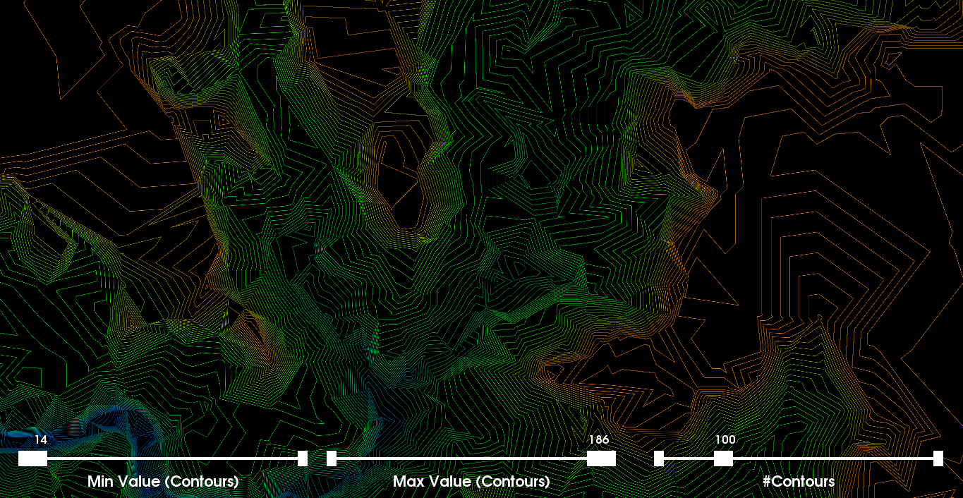
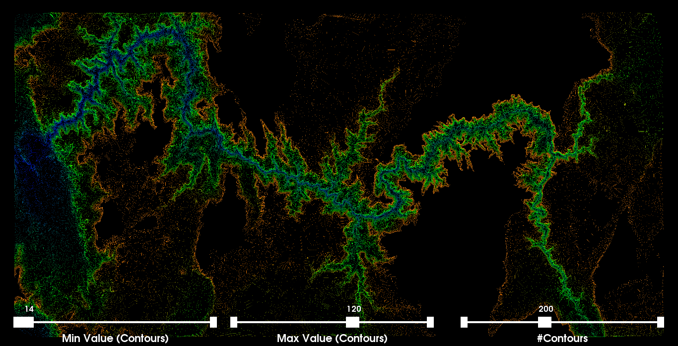
Part 3: Contour MapsWe now create a visualization using contour lines. A contour line for a function of two variables (i.e., 2D data points) is a curve connecting two points where the function itself has the same values. A result of the contour map is that when lines are close together, the gradient is large (i.e., large variation or difference between altitudes). More formally, the contour interval is the difference in altitude between two contour lines. The previous interpolation from the 2D Delaunay triangulation is used as a basis to construct the contour maps and therefore the accuracy of any contour map is inherently dependent on the estimated continuous values from the piecewise interpolation algorithm from the triangulation. Discussion: For the contour map visualization we create sliders to allow the user to interactively change the scalar range associated with the generation of the contour lines. We set the default values of each slider to their corresponding min and max altitudes within the specific dataset we are visualizing (i.e., [14,186]). We also provide a slider to allow the user to modify the number of contour lines generated across the selected scalar range. We set the default number of contour lines to 100 and allow the user to generate up to 300 contour lines within the scalar range (i.e., which in this case is smaller). We render the contour lines as tubes and use the color transfer function from the previous part along with the selected values [100,140]. The first image on the right shows the global view of the contour map. This image more accurately highlights the varying regions of altitudes. The second and third images are zoomed-in on a specific location where the contour map is more clearly shown. There is clearly a 3D effect/illusion present. In the image below on the left, we set the max contours to 123 and the number of contours to 100 (i.e., to make the distinction more vivid). Adjusting the min and max scalar range for drawing contours, we can get a good sense of the distribution of altitudes throughout the image. Furthermore, in the image we see that by decreasing the max to 123, the semi-white/orangish contour regions and the pure orange regions disappear (i.e., from part two, we selected the pure orange color to be 140 and the white region represents altitudes of even more magnitude). Conversely, if we set the min to 99 then we see mostly the orange and semi-white regions (i.e., the other side of the altitude distribution; and their spatial arrangement). That is the blue region and a lot of the green region disappears. This effect is seen in the image below on the right. |
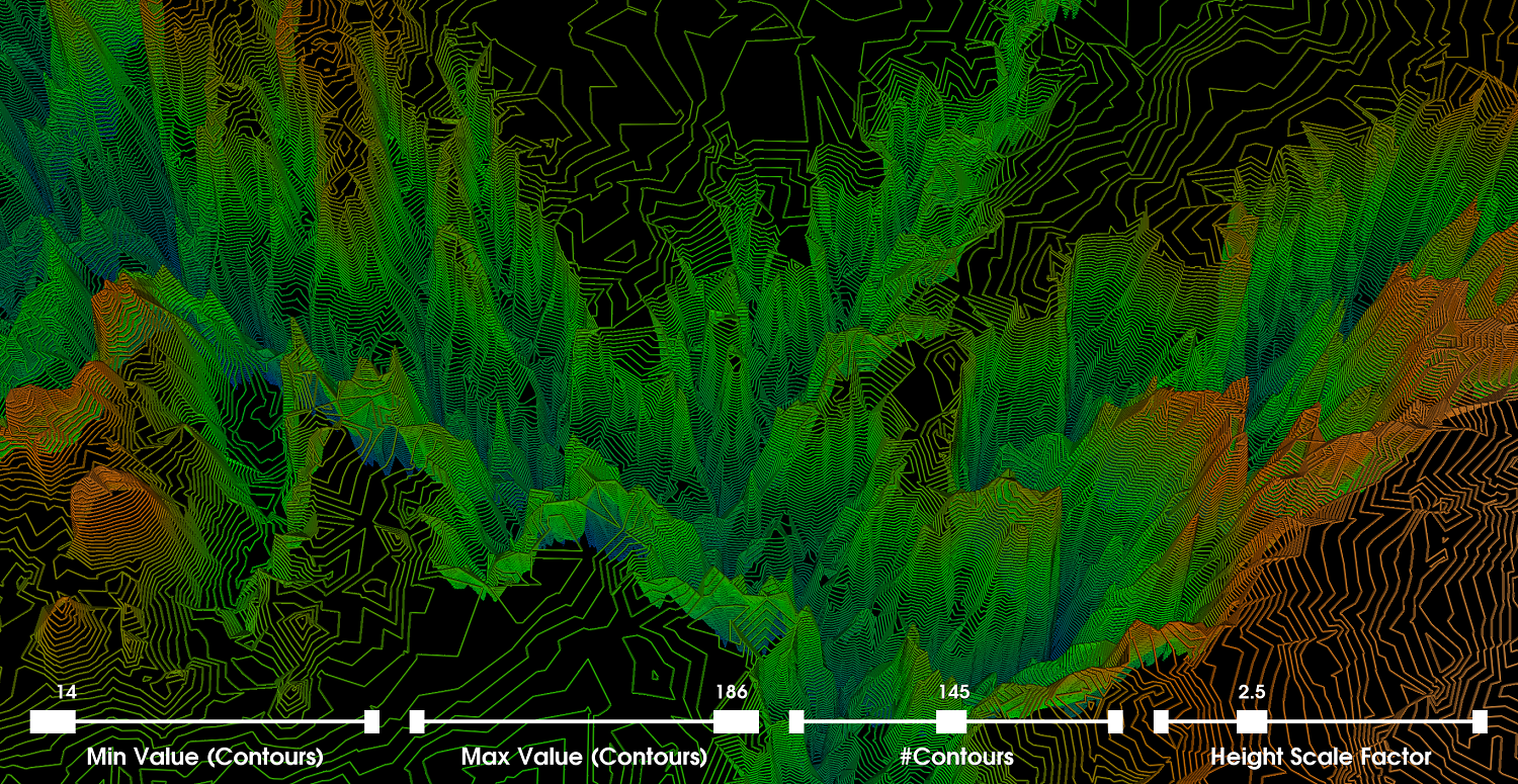
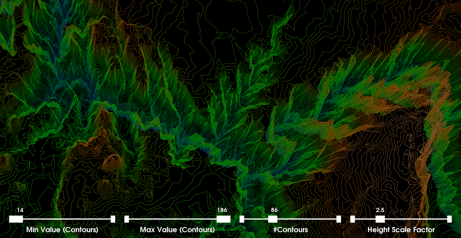
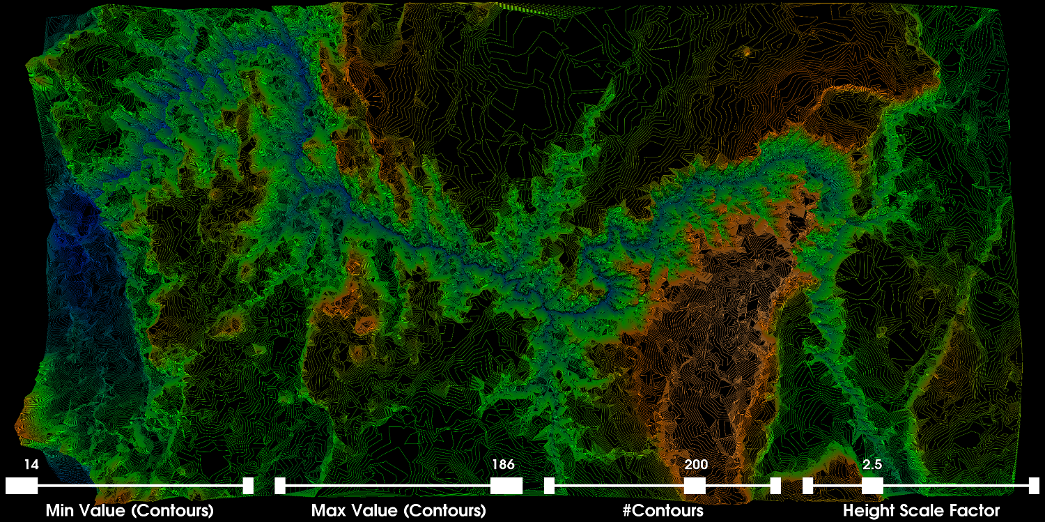
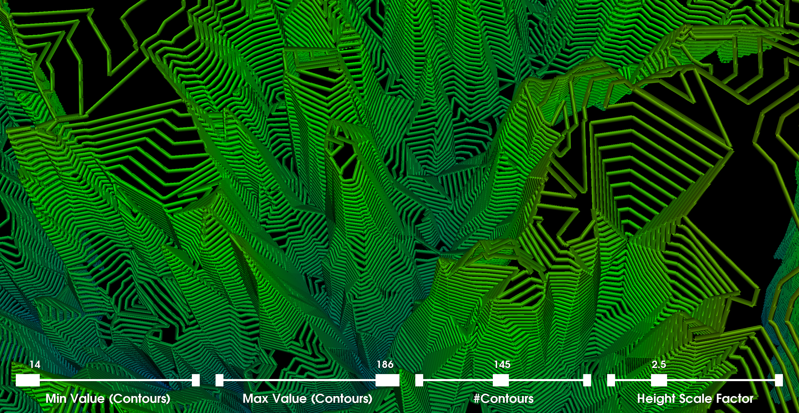
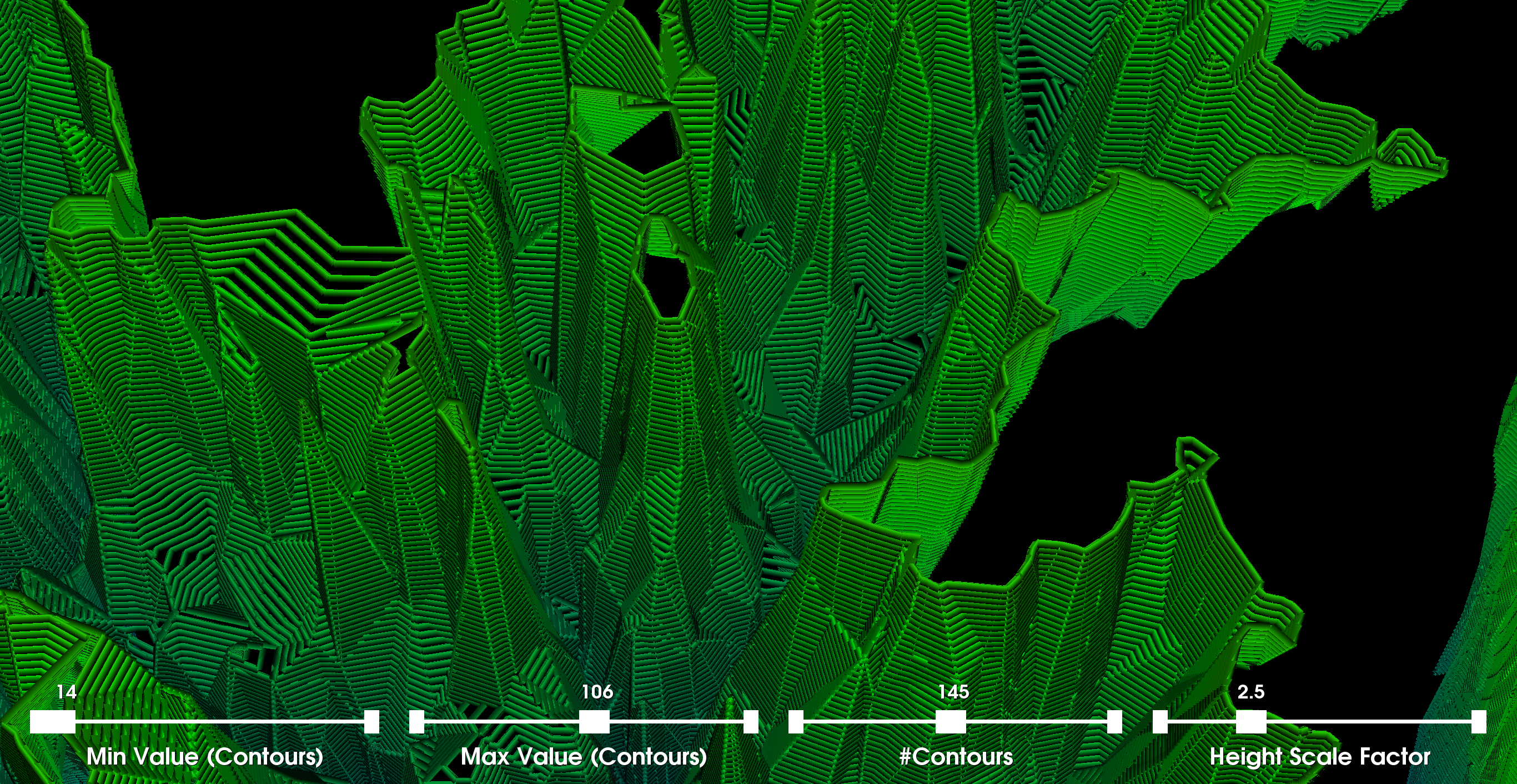
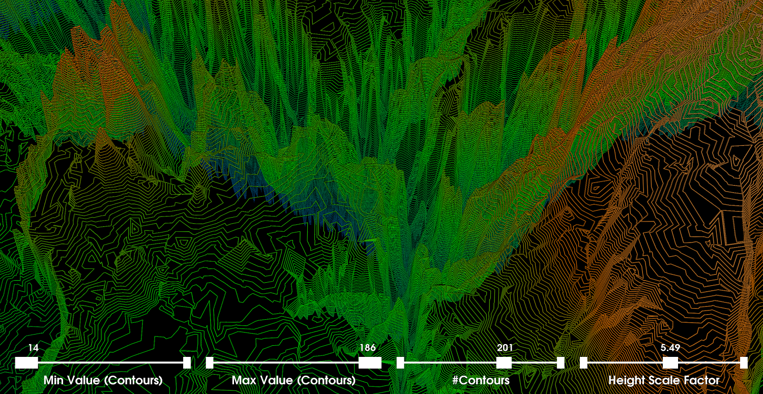
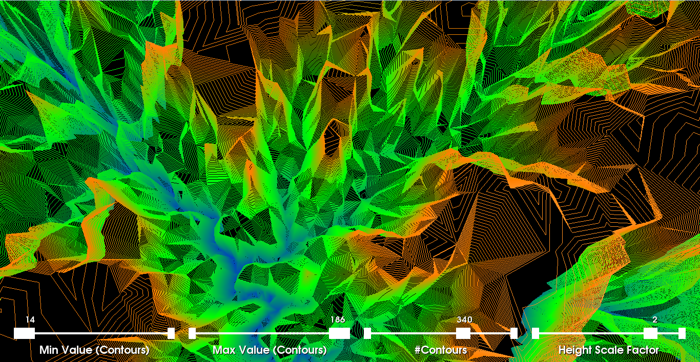
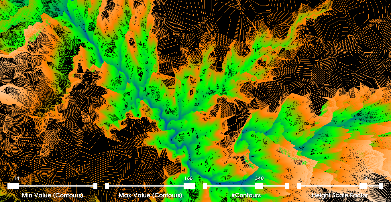
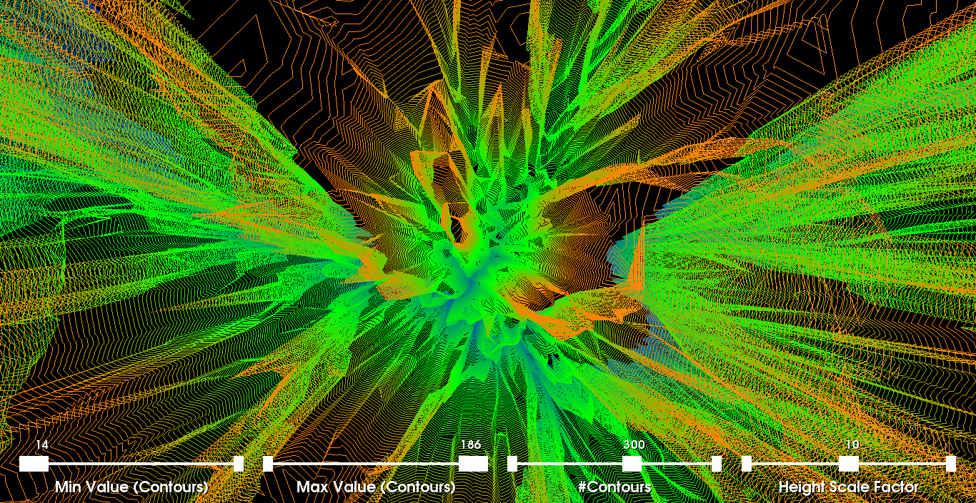
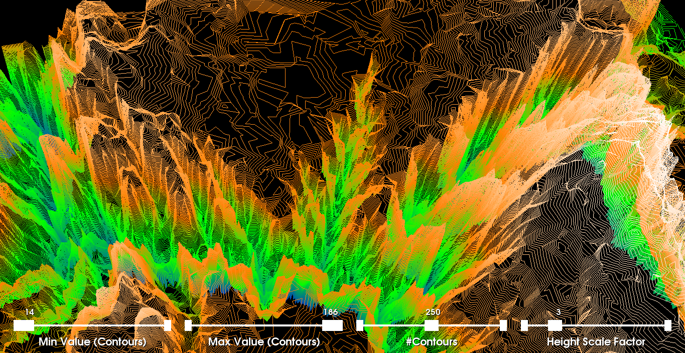
Part 4: Height FieldsIn the last visualization, we use the altitude scalar associated with each vertex as a height (3rd dimension). To do this visualization, we provide the user with an additional slider to scale the altitude by an arbitrary factor. More specifically, the WarpScalar filter uses any arbitrary scalar (i.e., altitude scalars) as the z-coordinate if not explictly provided within the dataset (i.e., as in our case; 2D points Discussion: This visualization is interesting in several ways. The contour lines based on the altitude have a significant impact on our perception of depth within this scalar field as shown in the first image. The second image (i.e., on the left) offers a global perspective where the number of contours is set to 200 and the scale factor is 2.5. In the other screenshots below, we vary these parameters as well as the camera/level of zooming. This visualization, by far, provides the scientist with the most useful information. We find that the choice of a scaling factor between 2 and 4 seems to be the most optimal and provides a relatively realistic depiction of the Grand Canyon. In particular, we chose 2.5 as our main scaling factor, but the others might be useful as well. |
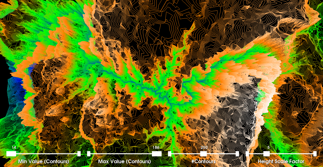
Other Experimental VisualizationsIn this section, we have included screenshots from other visualizations using the same dataset. More specifically, we use the scale factor to also brighten the colors and apply a few other filters as well. We also vary other parameters such as tube radius, shading properties, scaling factors, and many others. |
